TO LEARN IS TO GROW
Learning Center
We do our research and publish our results. Should probably call this the Growing Center.

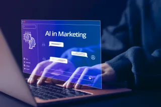
How Implementing AI in Marketing Can Benefit Your Business
A must-read for business owners to learn about the benefits, applications, and implementation of AI in marketing for business growth. ...more
Marketing ,Business Development
April 04, 2024•6 min read

Why Refreshing Your Brand Is Important for Business Growth
Learn why refreshing your brand and marketing strategies is key to growing your business and standing out in a crowded market. ...more
Marketing ,Business Development
March 27, 2024•5 min read

Do You Need Luck To Grow Your Business?
When it comes to growing a business, is luck really a factor? Read this blog to learn how you can drive growth for your business. ...more
Marketing ,Business Development
March 03, 2024•5 min read

5 Marketing Trends Set To Redefine 2024: Embrace the Future Now!
Discover the top five marketing trends shaping the digital landscape in 2024. Learn how your business can thrive by staying ahead of the curve! ...more
Marketing ,News
January 31, 2024•5 min read

Why Hire a Digital Marketing Agency? 9 Key Benefits to Consider
Why Hire a Digital Marketing Agency? 9 Key Benefits to Consider. This article is perfect for the business owner looking to learn more about hiring a digital marketing agency. ...more
Marketing
June 05, 2023•7 min read

ADA Tax Credit for Web Accessibility: Eligibility and Stipulations
ADA Tax Credit for Web Accessibility: Eligibility and Stipulations - This article is about website accessibility for the education of business owners. ...more
Website Accessibility
May 23, 2023•5 min read

6 Types of Marketing Automation: Benefits and Best Practices
6 Types of Marketing Automation: Benefits and Best Practices - this is an article about marketing automation and how it benefits your business ...more
Marketing
May 13, 2023•8 min read
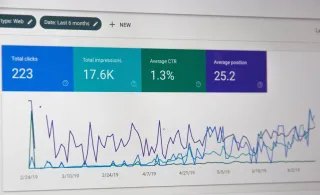
Is Your Marketing Working? Proven Ways To Measure Performance
Is Your Marketing Working? Proven Ways To Measure Performance - this blog talks about the proven ways you can know if your marketing is working. ...more
Marketing
May 01, 2023•9 min read

2023 Digital Marketing Forecast: What Marketers Need To Know
2023 Digital Marketing Forecast: What Marketers Need To Know is an article about what marketing need to know regarding marketing in 2023 ...more
Marketing
April 25, 2023•6 min read
How Implementing AI in Marketing Can Benefit Your Business
A must-read for business owners to learn about the benefits, applications, and implementation of AI in marketing for business growth. ...more
Marketing ,Business Development
April 04, 2024•6 min read
Why Refreshing Your Brand Is Important for Business Growth
Learn why refreshing your brand and marketing strategies is key to growing your business and standing out in a crowded market. ...more
Marketing ,Business Development
March 27, 2024•5 min read
Do You Need Luck To Grow Your Business?
When it comes to growing a business, is luck really a factor? Read this blog to learn how you can drive growth for your business. ...more
Marketing ,Business Development
March 03, 2024•5 min read
5 Marketing Trends Set To Redefine 2024: Embrace the Future Now!
Discover the top five marketing trends shaping the digital landscape in 2024. Learn how your business can thrive by staying ahead of the curve! ...more
Marketing ,News
January 31, 2024•5 min read
Why Hire a Digital Marketing Agency? 9 Key Benefits to Consider
Why Hire a Digital Marketing Agency? 9 Key Benefits to Consider. This article is perfect for the business owner looking to learn more about hiring a digital marketing agency. ...more
Marketing
June 05, 2023•7 min read
ADA Tax Credit for Web Accessibility: Eligibility and Stipulations
ADA Tax Credit for Web Accessibility: Eligibility and Stipulations - This article is about website accessibility for the education of business owners. ...more
Website Accessibility
May 23, 2023•5 min read
6 Types of Marketing Automation: Benefits and Best Practices
6 Types of Marketing Automation: Benefits and Best Practices - this is an article about marketing automation and how it benefits your business ...more
Marketing
May 13, 2023•8 min read
Is Your Marketing Working? Proven Ways To Measure Performance
Is Your Marketing Working? Proven Ways To Measure Performance - this blog talks about the proven ways you can know if your marketing is working. ...more
Marketing
May 01, 2023•9 min read
2023 Digital Marketing Forecast: What Marketers Need To Know
2023 Digital Marketing Forecast: What Marketers Need To Know is an article about what marketing need to know regarding marketing in 2023 ...more
Marketing
April 25, 2023•6 min read
Growing Businesses Since 2008
We have helped hundreds of businesses just like yours. Working for or along-side of business owner, managers, staff, or even board of directors, LOJO is ready to be an asset to your business.
Our team has been curated through the years for individual skills, personalities, and capabilities. Our clients put their trust in us to help them grow. We are here to do just that.

Matthew Rogers, President
iProspect Check
After spending several months reviewing multiple proposals from several different companies we engaged LOJO to develop a new website that represents our company effectively. We worked initially with Stephen Platte who helped create the scope of the project. Stephen was knowledgeable and always followed up with me on time and as promised.
He "closed the deal" for LOJO with his professionalism, service orientation and easy going approach. Once we signed the contract we were introduced to Jay Kelly who would be the creative lead for LOJO. This was the most challenging part of the project for my company, as there was no shortage of ideas from our side. Jay managed the project flawlessly, and once we had all agreed to the design, Jay introduced us to Eric.
Eric Lay is one of the founders of LOJO. Eric took the design we had developed and brought it to life. We delivered content as quickly as he requested it. Eric kept the project on task and we responded by exceeding every deadline for content. In turn, once provided, literally not a day went by that Eric didn't add the content and take the next step. In just a few weeks we launched our new website. Eric is a pleasure to work with.
His positive attitude and consultative approach really enhanced the experience and made a big difference for us in the outcome of our project. We would welcome you to visit our website to take a look at the quality work of LOJO. We are very pleased with LOJO and look forward to working with them in the future as we pursue an aggressive SEO strategy."
Matthew Rogers, President
iProspect Check
The team at LOJO were wonderful to work with. They are well organized and very patient as we worked through our marketing strategy and developed a well thought out and clear action plan at a reasonable price. We will definitely be back for our future campaign needs."

Jon Crosby, Founder
Dazil
(916) 303-4080
9AM - 5PM (PST) M-F
RESOURCE GUIDES
INDUSTRIES
RESOURCE GUIDES
RESOURCES
Search Engine Marketing
Social Media Marketing
Content Marketing
Marketing Automation
Logo & Branding
Website Design & Development
Hosting
Security
INDUSTRIES
RESOURCES
LOJO
© Copyright LOJO Marketing 2024