TO LEARN IS TO GROW
Learning Center
We do our research and publish our results. Should probably call this the Growing Center.

Logo Design: The Ultimate Guide
Nothing is static in business–consumer sentiments change, industry landscape evolves, and innovators continuously churn out new technologies. Hence, companies need to redesign their logo to show people that they are constantly adapting to the modern world. Logo design and redesign is also important if your visual representation no longer captures your company’s new core values, services, and/or products.
The right logo redesign can help strengthen your brand amidst today’s cutthroat competition. But if you do it wrong, your existing customers may confuse you with another business, cause reputational damage, and create inconsistency that can sabotage your growth.
Here, we list the most basic logo redesign tips to help you avoid costly mistakes that can lead to an identity crisis and damage your brand.
Keep it simple.
Keeping it simple doesn’t mean making it boring. On the contrary, leaning toward a more minimalist design allows you to convey a quicker and clearer message than a complicated design that often suffers from convoluted details.
Morton Salt Girl is a good example of keeping logo redesign simple. The company stayed true to their iconic brand when they decided to revamp their look; they simply removed the finer details to make their logo more “versatile,” meaning it can be applied to different mediums–from social media and websites to glossy brochures and posters–without the risk of inconsistency.
By contrast, it is often difficult to make complicated logos look consistent across different mediums and backgrounds.
Use color when you seek a complete overhaul.
Because color is inherently tied to your brand, you should only change it when you’re seeking a complete identity overhaul. For instance, your company’s services and products have changed significantly over the years.
Should you decide to change your color, you may want to consider a monochromatic theme, which means using different shades of the same color to achieve subtle contrasts within your logo. This method is also a good way to keep your visual identity simple but memorable.
But don't rely too much on color.
Your logo redesign should not only rely on color. Instead, make sure that you also consider other essential design elements like shapes, lines, texts, and symbols. In this way, your brand remains identifiable even if it is printed in a black-and-white color scheme or placed against a saturated background.
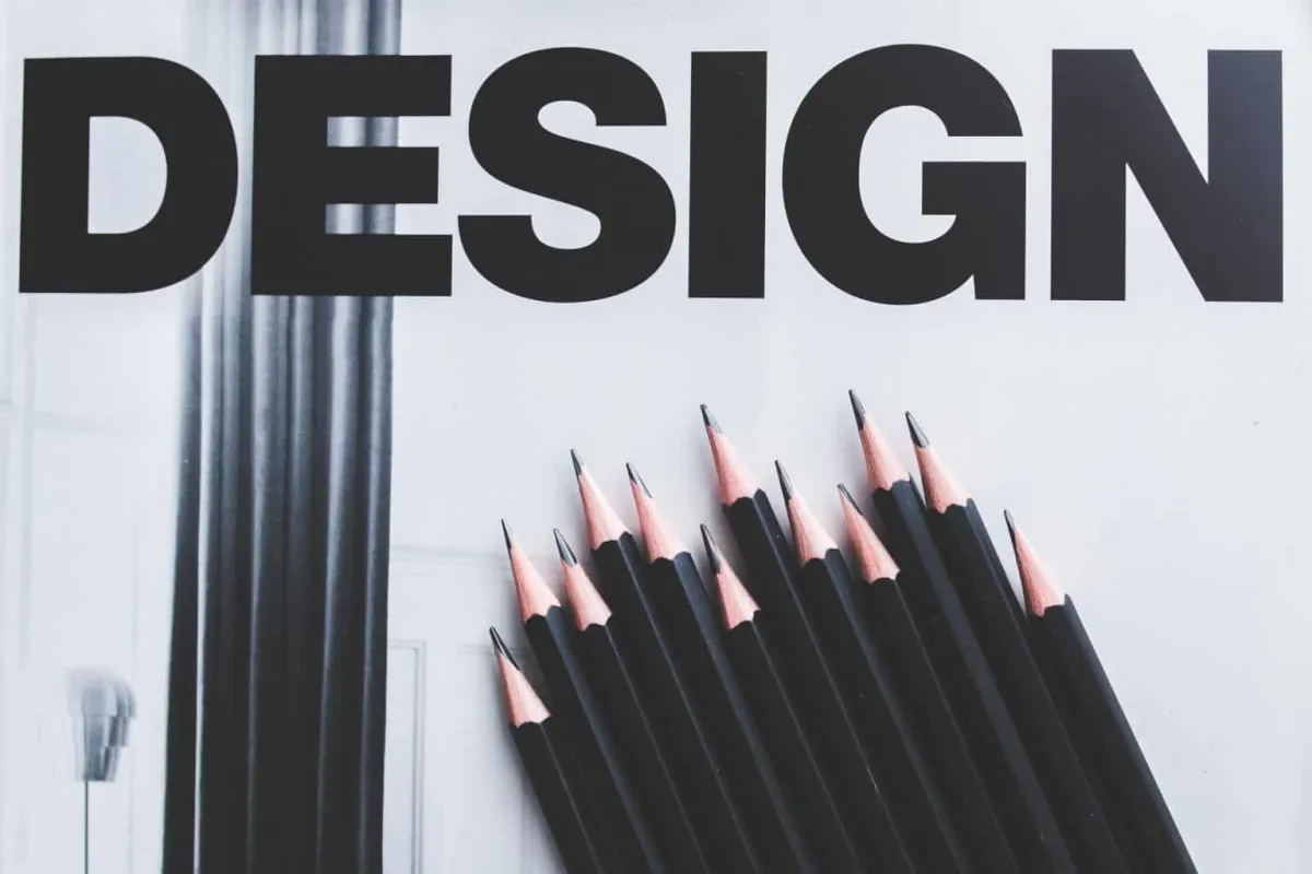
To make sure that your logo remains impressive even in a black and white scheme, sketch it using a pencil. If the design can stand on its own without color, it is a sign that it is catchy and memorable.
Make it scalable.
Make sure that your logo is scalable because it will be used on different platforms, from digital media and letterhead to presentations and giveaways like pens and t-shirts. Great scalability also means that your visual representation will remain impressive even when scaled up to larger proportions on a billboard or shrink down to be printed on a small piece of paper.

Choose the right fonts.
You may not be aware of it, but fonts have human-like personalities–some look elegant and classic, bold and rebellious, contemporary and innovative, formal and conservative, stylish and flashy, while others are easy-going and exciting or warm and friendly.
To give you some examples: Georgia and Times New Roman are perceived to be mature, formal, and pragmatic; Sans Serif fonts often denote elegance and contemporary; Bolded Serif fonts look sophisticated and glamorous; and Script typefaces exude warmth and friendliness.
Consider using memorable symbols.

If your logo only uses text, you may want to consider adding some quirky and memorable design elements that reflect your business’s core value. For example, think of Chanel and its iconic double c logo.
Use negative space correctly.
Negative space is an important design element that can make or break your logo redesign. With its proper use, you can create balanced and unified compositions, allowing the subject to catch people’s attention and at the same time provide a place for their eyes to rest.
These are the other benefits when you use negative space correctly:
You can create a symbol within a symbol.
Your logo’s typography is readable and understandable.
You can create an identifiable symbol inside a letterform.
Get multiple feedback.
A symbol that you think is a great visual representation of your company may look like an esoteric or even an offensive image for some people. For this reason, it is ideal that you get the opinion of several designers and a select group of social media followers (or existing clients). The idea is to use a relatable and understandable logo that conveys your company’s product, service, or core value.
Remember, not all symbols are universal. A good example is the Swastika sign that is closely associated with Nazis during World War II. Meanwhile, the same symbol called Manji is commonly used in Japan, especially in older cities to mark the locations of Buddhist temples (it is actually a sign of peace).
When using symbols, always be careful and try to be sensitive to other people’s culture.
Key Takeaway
If you want to redesign your logo, make sure that you have valid reasons to do so (and not out of whim). Without a concrete objective, there’s nothing to guide you during the redesign process.
Take note that a great logo leans more toward simplicity but is still unique, scalable, and versatile; it also has colors and fonts that reflect the brand personality.
To learn more about logo creation and redesign, call LOJO Marketing at 916 303-4080
or schedule a free appointment. We are a team of graphics and design artists, digital marketing experts, social media strategists, and content creators who can help improve your online brand.

Logo Design: The Ultimate Guide
Nothing is static in business–consumer sentiments change, industry landscape evolves, and innovators continuously churn out new technologies. Hence, companies need to redesign their logo to show people that they are constantly adapting to the modern world. Logo design and redesign is also important if your visual representation no longer captures your company’s new core values, services, and/or products.
The right logo redesign can help strengthen your brand amidst today’s cutthroat competition. But if you do it wrong, your existing customers may confuse you with another business, cause reputational damage, and create inconsistency that can sabotage your growth.
Here, we list the most basic logo redesign tips to help you avoid costly mistakes that can lead to an identity crisis and damage your brand.
Keep it simple.
Keeping it simple doesn’t mean making it boring. On the contrary, leaning toward a more minimalist design allows you to convey a quicker and clearer message than a complicated design that often suffers from convoluted details.
Morton Salt Girl is a good example of keeping logo redesign simple. The company stayed true to their iconic brand when they decided to revamp their look; they simply removed the finer details to make their logo more “versatile,” meaning it can be applied to different mediums–from social media and websites to glossy brochures and posters–without the risk of inconsistency.
By contrast, it is often difficult to make complicated logos look consistent across different mediums and backgrounds.
Use color when you seek a complete overhaul.
Because color is inherently tied to your brand, you should only change it when you’re seeking a complete identity overhaul. For instance, your company’s services and products have changed significantly over the years.
Should you decide to change your color, you may want to consider a monochromatic theme, which means using different shades of the same color to achieve subtle contrasts within your logo. This method is also a good way to keep your visual identity simple but memorable.
But don't rely too much on color.
Your logo redesign should not only rely on color. Instead, make sure that you also consider other essential design elements like shapes, lines, texts, and symbols. In this way, your brand remains identifiable even if it is printed in a black-and-white color scheme or placed against a saturated background.
To make sure that your logo remains impressive even in a black and white scheme, sketch it using a pencil. If the design can stand on its own without color, it is a sign that it is catchy and memorable.
Make it scalable.
Make sure that your logo is scalable because it will be used on different platforms, from digital media and letterhead to presentations and giveaways like pens and t-shirts. Great scalability also means that your visual representation will remain impressive even when scaled up to larger proportions on a billboard or shrink down to be printed on a small piece of paper.
Choose the right fonts.
You may not be aware of it, but fonts have human-like personalities–some look elegant and classic, bold and rebellious, contemporary and innovative, formal and conservative, stylish and flashy, while others are easy-going and exciting or warm and friendly.
To give you some examples: Georgia and Times New Roman are perceived to be mature, formal, and pragmatic; Sans Serif fonts often denote elegance and contemporary; Bolded Serif fonts look sophisticated and glamorous; and Script typefaces exude warmth and friendliness.
Consider using memorable symbols.
If your logo only uses text, you may want to consider adding some quirky and memorable design elements that reflect your business’s core value. For example, think of Chanel and its iconic double c logo.
Use negative space correctly.
Negative space is an important design element that can make or break your logo redesign. With its proper use, you can create balanced and unified compositions, allowing the subject to catch people’s attention and at the same time provide a place for their eyes to rest.
These are the other benefits when you use negative space correctly:
You can create a symbol within a symbol.
Your logo’s typography is readable and understandable.
You can create an identifiable symbol inside a letterform.
Get multiple feedback.
A symbol that you think is a great visual representation of your company may look like an esoteric or even an offensive image for some people. For this reason, it is ideal that you get the opinion of several designers and a select group of social media followers (or existing clients). The idea is to use a relatable and understandable logo that conveys your company’s product, service, or core value.
Remember, not all symbols are universal. A good example is the Swastika sign that is closely associated with Nazis during World War II. Meanwhile, the same symbol called Manji is commonly used in Japan, especially in older cities to mark the locations of Buddhist temples (it is actually a sign of peace).
When using symbols, always be careful and try to be sensitive to other people’s culture.
Key Takeaway
If you want to redesign your logo, make sure that you have valid reasons to do so (and not out of whim). Without a concrete objective, there’s nothing to guide you during the redesign process.
Take note that a great logo leans more toward simplicity but is still unique, scalable, and versatile; it also has colors and fonts that reflect the brand personality.
To learn more about logo creation and redesign, call LOJO Marketing at 916 303-4080
or schedule a free appointment. We are a team of graphics and design artists, digital marketing experts, social media strategists, and content creators who can help improve your online brand.
Growing Businesses Since 2008
We have helped hundreds of businesses just like yours. Working for or along-side of business owner, managers, staff, or even board of directors, LOJO is ready to be an asset to your business.
Our team has been curated through the years for individual skills, personalities, and capabilities. Our clients put their trust in us to help them grow. We are here to do just that.

Matthew Rogers, President
iProspect Check
After spending several months reviewing multiple proposals from several different companies we engaged LOJO to develop a new website that represents our company effectively. We worked initially with Stephen Platte who helped create the scope of the project. Stephen was knowledgeable and always followed up with me on time and as promised.
He "closed the deal" for LOJO with his professionalism, service orientation and easy going approach. Once we signed the contract we were introduced to Jay Kelly who would be the creative lead for LOJO. This was the most challenging part of the project for my company, as there was no shortage of ideas from our side. Jay managed the project flawlessly, and once we had all agreed to the design, Jay introduced us to Eric.
Eric Lay is one of the founders of LOJO. Eric took the design we had developed and brought it to life. We delivered content as quickly as he requested it. Eric kept the project on task and we responded by exceeding every deadline for content. In turn, once provided, literally not a day went by that Eric didn't add the content and take the next step. In just a few weeks we launched our new website. Eric is a pleasure to work with.
His positive attitude and consultative approach really enhanced the experience and made a big difference for us in the outcome of our project. We would welcome you to visit our website to take a look at the quality work of LOJO. We are very pleased with LOJO and look forward to working with them in the future as we pursue an aggressive SEO strategy."
Matthew Rogers, President
iProspect Check
The team at LOJO were wonderful to work with. They are well organized and very patient as we worked through our marketing strategy and developed a well thought out and clear action plan at a reasonable price. We will definitely be back for our future campaign needs."

Jon Crosby, Founder
Dazil
(916) 303-4080
9AM - 5PM (PST) M-F
RESOURCE GUIDES
INDUSTRIES
RESOURCE GUIDES
RESOURCES
Search Engine Marketing
Social Media Marketing
Content Marketing
Marketing Automation
Logo & Branding
Website Design & Development
Hosting
Security
INDUSTRIES
RESOURCES
LOJO
© Copyright LOJO Marketing 2024