TO LEARN IS TO GROW
Learning Center
We do our research and publish our results. Should probably call this the Growing Center.

Minimalist Web Design: Is It Just a Trend or Does It Improve User Experience?
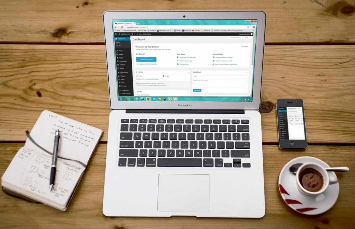
A minimalist web design removes all unnecessary elements, including the intrusive pop-up boxes, so the brand’s true form is accentuated. It also results in fast-loading websites and improved user experience.
A minimalist web design is not about a boring, bare-bones project created by someone who is pressed for time, as some people might have assumed. On the contrary, its principle takes a lot of time to master because the designer has to balance between stripping a website to its essentials while delivering an excellent user experience.
Most web designers follow minimalism, not for the sake of the “less is more” principle, but to improve user experience, which they believe can be achieved if all the unnecessary elements are removed.
What Is Minimalism in Web Design?
Whether minimalism is applied in interior designing, fashion, art, and web design, its focus remains the same: simplicity. By focusing on simplicity, the brand’s true form is accentuated, the message is clear, and there is no distraction from nonessential elements.
Most websites with a minimalist design use high color contrast to further accentuate the brand’s true form and create more impact. Also, they often come with a limited color palette (i.e., not more than three colors), with some even using a monochromatic theme.
By limiting the color scheme, the content becomes the focal point.
Google: The Poster Child of Minimalist Design
The Google homepage best exemplifies the principle of minimalist web design. There are no unnecessary buttons, no distractions, limited use of color, and uncluttered white background–all of which allow the brand to stand out.
Google’s minimalist design aims to improve user experience and attract their attention amidst the buzzing white noise from the Internet.
User Experience
Contrary to popular belief, minimalism in web design is not just about creating a simple visual layout. To reiterate, its goal is to simplify the overall interface for the user, making sure that each design element and content has its purpose.
And with the lack of complexity, the content loads faster, the web page adjusts better to the screen (especially the smaller screen of mobile devices), which improves not just the user experience but also the website’s Google ranking.
According to best practices, mobile sites should load 1-2 seconds, or even shorter when they are used for eCommerce. Some industry experts even recommend a half-second loading time for eCommerce websites to avoid high bounce rates and poor conversion rates.

Load Speed
In a 2017 study involving thousands of Google’s advertising partners, the majority of mobile sites were slow and bloated with too many design elements. The researchers also found that bloated, snail-paced pages were prevalent on retail, automotive, and technology websites.
These are some of the problems the researchers highlighted:
Around 70% of the pages took seven seconds for the visual content above the fold to load on the screen, while the element above and below the fold took more than 10 seconds.
The study involved about 900,000 mobile ads’ landing pages in which the average loading time was 22 seconds.
Around 53% of mobile users would abandon a site that took three seconds to load.
Image and Load Speed
Image is one of the most source-hogging design elements that bog down the speed. However, removing photos altogether is not an option, especially in eCommerce and other industries that rely heavily on images.
Ecommerce sites need to load fast or they will experience high bounce rates, but removing photos altogether is not an option because they are directly related to the conversion rates and sales. In fact, one study found that 66% of online shoppers wanted to see a minimum of three product images before making a purchase.
Simply put, images are a necessity not just in eCommerce but also in almost all websites, including those with a minimalist design.
One way to use images without bogging down the website is to compress or resize them. In one study, reducing 22 MB images to 300 kb resulted in around 70% improvement in the interaction time or the amount of time a user needs to wait before the site interacts with him.
Cropping is one way to reduce an image file. For example, an eCommerce website that needs a 500 x 500 pixel photo should crop it based on this size instead of uploading a 2,000 x 1,500 pixel image and then later resizing it based on the parameter size needed. Unfortunately, the latter is a common mistake committed by many amateur web designers.
Using the width parameter to make images smaller on the web page can cause the site to take longer to “show” the full image.
Another way to make images “speed-friendly” is to compress them, which is particularly easy if a site runs on WordPress that offers several plugins such as WP Smush that automatically compress the new image files.
By setting a maximum height and width, the WP Smush can also automatically resize the image files that exceed the pre-set limit.
There are also non-WordPress tools that automatically resize or compress images based on the pre-set limits and requirements.
Meanwhile, many people think that the type of image file (e.g., GIF, JPG, PNG, etc.) has no or little effect on their site’s loading speed, which is far from the truth.
In general, JPG is the best image format. While it uses lossy compression, meaning some of the data is lost, this loss is undetectable to viewers and does not affect their user experience.
PNG, meanwhile, saves images via lossless compression, meaning that it doesn’t lose any data. While it results in crispier details, the downside is the increased loading times. For this reason, it is best reserved for elements that need detailed graphics like screenshots and logos.
Other Benefits of Minimalism in Website Design
Aside from fast-loading websites, a minimalist design offers other benefits such as high conversion rates.
High conversion rates are not only tied to speed but also to easy-to-digest messages. Because today’s consumers are impatient and want quick information, they prefer websites with few but carefully curated content. This is particularly true for eCommerce websites that rely on quality images with a short tagline that delivers a complete message, e.g., dress size, fabric, available color, and price.
And because minimalism eliminates all unnecessary elements, including the annoying pop-ups, it improves user experience, leading to high conversion rates and reduced bounce rates.
Allowing consumers to discover the offer themselves, without the intrusive pop-up boxes, is one surefire way to improve user experience and encourage repeat business.
And with the uncluttered layout, users will find it easy to navigate through the site, which is also tied to high conversion rates.
Unlike websites that lean towards maximalism and require constant updates and plugins to improve security and functionality, minimalist sites generally need less maintenance.
Final Thought About Minimalist Web Design: Is It Just a Trend or Does It Improve User Experience?
Simplicity should not be done for the sake of following the “less is more” principle. First and foremost, the user experience is of the utmost importance, so keeping it simple should not result in limitations.
One common mistake of designers attempting to stick to a minimalist design is that they conceal elements that make navigation easy. This can put off even the most patient users who need to spend more time figuring out how the site works than focusing on what it offers.
If you want to create a minimalist and functional website that reflects your brand and your target consumer’s demographics and buying behavior, contact LOJO at (916) 303-4080.

Minimalist Web Design: Is It Just a Trend or Does It Improve User Experience?
A minimalist web design removes all unnecessary elements, including the intrusive pop-up boxes, so the brand’s true form is accentuated. It also results in fast-loading websites and improved user experience.
A minimalist web design is not about a boring, bare-bones project created by someone who is pressed for time, as some people might have assumed. On the contrary, its principle takes a lot of time to master because the designer has to balance between stripping a website to its essentials while delivering an excellent user experience.
Most web designers follow minimalism, not for the sake of the “less is more” principle, but to improve user experience, which they believe can be achieved if all the unnecessary elements are removed.
What Is Minimalism in Web Design?
Whether minimalism is applied in interior designing, fashion, art, and web design, its focus remains the same: simplicity. By focusing on simplicity, the brand’s true form is accentuated, the message is clear, and there is no distraction from nonessential elements.
Most websites with a minimalist design use high color contrast to further accentuate the brand’s true form and create more impact. Also, they often come with a limited color palette (i.e., not more than three colors), with some even using a monochromatic theme.
By limiting the color scheme, the content becomes the focal point.
Google: The Poster Child of Minimalist Design
The Google homepage best exemplifies the principle of minimalist web design. There are no unnecessary buttons, no distractions, limited use of color, and uncluttered white background–all of which allow the brand to stand out.
Google’s minimalist design aims to improve user experience and attract their attention amidst the buzzing white noise from the Internet.
User Experience
Contrary to popular belief, minimalism in web design is not just about creating a simple visual layout. To reiterate, its goal is to simplify the overall interface for the user, making sure that each design element and content has its purpose.
And with the lack of complexity, the content loads faster, the web page adjusts better to the screen (especially the smaller screen of mobile devices), which improves not just the user experience but also the website’s Google ranking.
According to best practices, mobile sites should load 1-2 seconds, or even shorter when they are used for eCommerce. Some industry experts even recommend a half-second loading time for eCommerce websites to avoid high bounce rates and poor conversion rates.
Load Speed
In a 2017 study involving thousands of Google’s advertising partners, the majority of mobile sites were slow and bloated with too many design elements. The researchers also found that bloated, snail-paced pages were prevalent on retail, automotive, and technology websites.
These are some of the problems the researchers highlighted:
Around 70% of the pages took seven seconds for the visual content above the fold to load on the screen, while the element above and below the fold took more than 10 seconds.
The study involved about 900,000 mobile ads’ landing pages in which the average loading time was 22 seconds.
Around 53% of mobile users would abandon a site that took three seconds to load.
Image and Load Speed
Image is one of the most source-hogging design elements that bog down the speed. However, removing photos altogether is not an option, especially in eCommerce and other industries that rely heavily on images.
Ecommerce sites need to load fast or they will experience high bounce rates, but removing photos altogether is not an option because they are directly related to the conversion rates and sales. In fact, one study found that 66% of online shoppers wanted to see a minimum of three product images before making a purchase.
Simply put, images are a necessity not just in eCommerce but also in almost all websites, including those with a minimalist design.
One way to use images without bogging down the website is to compress or resize them. In one study, reducing 22 MB images to 300 kb resulted in around 70% improvement in the interaction time or the amount of time a user needs to wait before the site interacts with him.
Cropping is one way to reduce an image file. For example, an eCommerce website that needs a 500 x 500 pixel photo should crop it based on this size instead of uploading a 2,000 x 1,500 pixel image and then later resizing it based on the parameter size needed. Unfortunately, the latter is a common mistake committed by many amateur web designers.
Using the width parameter to make images smaller on the web page can cause the site to take longer to “show” the full image.
Another way to make images “speed-friendly” is to compress them, which is particularly easy if a site runs on WordPress that offers several plugins such as WP Smush that automatically compress the new image files.
By setting a maximum height and width, the WP Smush can also automatically resize the image files that exceed the pre-set limit.
There are also non-WordPress tools that automatically resize or compress images based on the pre-set limits and requirements.
Meanwhile, many people think that the type of image file (e.g., GIF, JPG, PNG, etc.) has no or little effect on their site’s loading speed, which is far from the truth.
In general, JPG is the best image format. While it uses lossy compression, meaning some of the data is lost, this loss is undetectable to viewers and does not affect their user experience.
PNG, meanwhile, saves images via lossless compression, meaning that it doesn’t lose any data. While it results in crispier details, the downside is the increased loading times. For this reason, it is best reserved for elements that need detailed graphics like screenshots and logos.
Other Benefits of Minimalism in Website Design
Aside from fast-loading websites, a minimalist design offers other benefits such as high conversion rates.
High conversion rates are not only tied to speed but also to easy-to-digest messages. Because today’s consumers are impatient and want quick information, they prefer websites with few but carefully curated content. This is particularly true for eCommerce websites that rely on quality images with a short tagline that delivers a complete message, e.g., dress size, fabric, available color, and price.
And because minimalism eliminates all unnecessary elements, including the annoying pop-ups, it improves user experience, leading to high conversion rates and reduced bounce rates.
Allowing consumers to discover the offer themselves, without the intrusive pop-up boxes, is one surefire way to improve user experience and encourage repeat business.
And with the uncluttered layout, users will find it easy to navigate through the site, which is also tied to high conversion rates.
Unlike websites that lean towards maximalism and require constant updates and plugins to improve security and functionality, minimalist sites generally need less maintenance.
Final Thought About Minimalist Web Design: Is It Just a Trend or Does It Improve User Experience?
Simplicity should not be done for the sake of following the “less is more” principle. First and foremost, the user experience is of the utmost importance, so keeping it simple should not result in limitations.
One common mistake of designers attempting to stick to a minimalist design is that they conceal elements that make navigation easy. This can put off even the most patient users who need to spend more time figuring out how the site works than focusing on what it offers.
If you want to create a minimalist and functional website that reflects your brand and your target consumer’s demographics and buying behavior, contact LOJO at (916) 303-4080.
Growing Businesses Since 2008
We have helped hundreds of businesses just like yours. Working for or along-side of business owner, managers, staff, or even board of directors, LOJO is ready to be an asset to your business.
Our team has been curated through the years for individual skills, personalities, and capabilities. Our clients put their trust in us to help them grow. We are here to do just that.

Matthew Rogers, President
iProspect Check
After spending several months reviewing multiple proposals from several different companies we engaged LOJO to develop a new website that represents our company effectively. We worked initially with Stephen Platte who helped create the scope of the project. Stephen was knowledgeable and always followed up with me on time and as promised.
He "closed the deal" for LOJO with his professionalism, service orientation and easy going approach. Once we signed the contract we were introduced to Jay Kelly who would be the creative lead for LOJO. This was the most challenging part of the project for my company, as there was no shortage of ideas from our side. Jay managed the project flawlessly, and once we had all agreed to the design, Jay introduced us to Eric.
Eric Lay is one of the founders of LOJO. Eric took the design we had developed and brought it to life. We delivered content as quickly as he requested it. Eric kept the project on task and we responded by exceeding every deadline for content. In turn, once provided, literally not a day went by that Eric didn't add the content and take the next step. In just a few weeks we launched our new website. Eric is a pleasure to work with.
His positive attitude and consultative approach really enhanced the experience and made a big difference for us in the outcome of our project. We would welcome you to visit our website to take a look at the quality work of LOJO. We are very pleased with LOJO and look forward to working with them in the future as we pursue an aggressive SEO strategy."
Matthew Rogers, President
iProspect Check
The team at LOJO were wonderful to work with. They are well organized and very patient as we worked through our marketing strategy and developed a well thought out and clear action plan at a reasonable price. We will definitely be back for our future campaign needs."

Jon Crosby, Founder
Dazil

(916) 303-4080
9AM - 5PM (PST) M-F
RESOURCE GUIDES
INDUSTRIES
RESOURCE GUIDES
RESOURCES
Search Engine Marketing
Social Media Marketing
Content Marketing
Marketing Automation
Logo & Branding
Website Design & Development
Hosting
Security
INDUSTRIES
RESOURCES
LOJO
© Copyright LOJO Marketing 2024