TO LEARN IS TO GROW
Learning Center
We do our research and publish our results. Should probably call this the Growing Center.

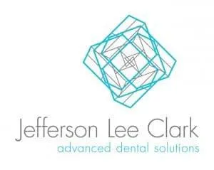
Case Study: Jefferson Lee Clark Logo
Jeff Clark came to us as a talented Prosthodontist in need of a new brand. He had already moved into a recently acquired practice in Roseville, California, and needed his logo and website to match his style and level of professionalism. Our method of approach began the same way as many of our clients, but evolved into one of our most in-depth and exhaustive logo design projects to date.
We begin every design project with an initial client interview with the purpose of sorting out personal preferences, background, inspirations, target audience, and the unique personality of Dr. Clark. Many descriptive words came up; luxurious, inquisitive, hospitable, architectural, hand-crafted, charming, authentic, and rustic to name a few, as well as the usual suspects like modern, clean, and professional. After our meeting I dove head first into more research in his field and mind-mapped all the keywords that best describe his business.

Round 1
My initial conclusion was not what Dr. Clark was expecting. In my research and brainstorming I came across 3 core concepts: a loop, a diamond, and a ray of light. Each concept was an abstraction of the different aspects of his profession and style. After several pages of sketches and combining shapes and ideas, I decided to share my initial findings with Dr. Clark. He was not pleased with the direction I initially pursued. It was still very early in the process and I hadn’t spent any of the time digitizing any of my sketches just yet, so I decided to move onto font selection.
Round 2
It was a challenge narrowing down which fonts to present to him as viable options, but we had made a significant shift in our approach, and Dr. Clark was very pleased with the result. He decided on a font to use with little effort, which led to more inspiration for additional sketches and concepts.

Round 3
From the new round of sketches produced we were able to render and narrow down several digital versions for Dr. Clark to select from, but one stood out among the rest with potential. It needed a lot of tweaking, clean-up, and color experimentation, but we’d found the right style and message. The concept had stemmed from an architectural logo that had been dissected into parts, rearranged and reassembled. It represented the meticulous nature of Dr. Clark’s field, and captured the complexities of his personality.

Round 4
Even though we had discovered what would ultimately evolve into the final logo, Dr. Clark was not ready to commit to it yet, and needed some additional versions of previous concepts to know for sure that he didn’t want to pursue any other options. Often times when clients are presented with too many choices it can delay the process of elimination. In this case, we were at a crossroads. We had a core concept that worked, and other useable concepts that needed discarding. It was the final hurdle before the downhill portion of the marathon.
Rounds 5–11
We combined color options, layout variations, transparency ranges, and even shape alterations in the next round. We again tried combining versions to create new versions, nearly exhausting every possible color combination. After narrowing it down to a few options, we found ourselves circling back to the same color combinations. It was at this point when Dr. Clark was ready to make a final decision.
With all that transpired during the logo design process, none of us could have predicted the twists and turns we would take to arrive at the finish line. There were moments of doubt and moments of triumph. The one thing that matters most is that when the smoke clears, Dr. Clark was left with a logo he could call perfect.
View Dr. Clark’s brand new custom designed logo.

Stay Creative,
Jay Kelly
Creative Lead, LOJO

Built for Growth. Backed by 25 Years of Trust.
For over two decades, LOJO has been a trusted partner to hundreds of businesses just like yours. Whether working directly with owners, managers, teams, or boards of directors, our goal remains the same: to be a reliable and results-driven asset to your business.
Over the years, we’ve carefully built a team of experts—each selected for their unique skills, strengths, and personalities. Our clients choose LOJO because they know we genuinely care about their success.
And after 25 years of helping businesses grow, we’re more committed than ever.

Matthew Rogers, President
iProspect Check
After spending several months reviewing multiple proposals from several different companies we engaged LOJO to develop a new website that represents our company effectively. We worked initially with Stephen Platte who helped create the scope of the project. Stephen was knowledgeable and always followed up with me on time and as promised.
He "closed the deal" for LOJO with his professionalism, service orientation and easy going approach. Once we signed the contract we were introduced to Jay Kelly who would be the creative lead for LOJO. This was the most challenging part of the project for my company, as there was no shortage of ideas from our side. Jay managed the project flawlessly, and once we had all agreed to the design, Jay introduced us to Eric.
Eric Lay is one of the founders of LOJO. Eric took the design we had developed and brought it to life. We delivered content as quickly as he requested it. Eric kept the project on task and we responded by exceeding every deadline for content. In turn, once provided, literally not a day went by that Eric didn't add the content and take the next step. In just a few weeks we launched our new website. Eric is a pleasure to work with.
His positive attitude and consultative approach really enhanced the experience and made a big difference for us in the outcome of our project. We would welcome you to visit our website to take a look at the quality work of LOJO. We are very pleased with LOJO and look forward to working with them in the future as we pursue an aggressive SEO strategy."
Matthew Rogers, President
iProspect Check
The team at LOJO were wonderful to work with. They are well organized and very patient as we worked through our marketing strategy and developed a well thought out and clear action plan at a reasonable price. We will definitely be back for our future campaign needs."

Jon Crosby, Founder
Dazil