TO LEARN IS TO GROW
Learning Center
We do our research and publish our results. Should probably call this the Growing Center.

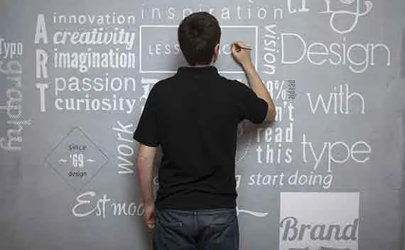
5 Web Design Tips That Lead to Higher Conversions
Web design has evolved into an important element in increasing conversions for your business. Gone were the days of blinking, rolling texts, colorful backgrounds, and even audio playing in the background. Nowadays, web designers have put away those practices, and have leveled up the game with professional website designs.
As a premier web design company, LOJO Sacramento has continuously changed their game plan in order to meet the demands of our clients. Along the way, we have created some practices that we apply on our projects; and now, we’re going to share our best practices in creating a website that yields high conversion rates:
Never forget the fundamentals. Here at LOJO Sacramento, we take web design seriously. Instead of focusing on where to place anything and everything, we’d rather tackle the infamous blunder of all time — type design. Most websites present their content in textual form; thus, a fundamental type design is a must in working out a web design plan. You don’t simply select a newspaper type design or bold anything that looks like it’s important. In web design, we follow simple rules in devising our plans for our client’s type design:
Titles, whether of articles or pages, should be: bold, concise but catchy, and easy to the eyes to deliver the information readily. This as well entices the readers to read on the article as their brains have processed the titles with ease.
In designing an article page, make sure to use a font type such as a serif typeface. Increase the size of your font so your readers don’t have to squint their eyes to read it. It is recommended to start with 16px. Lines shouldn’t be too long; the article shouldn’t sweep across the monitor. Ease the article into a format that will make it easier for the reader to read downwards; as much as possible, don’t design a page that will make your eyes sweep from side to side as it may tire your eyes, hence reducing readability on your audience’s part.
Marry a font style. But before you marry one, assure yourself that the font style speaks for you and your company. If you’re selling children’s toys while using a boring, serious font, then it can ruin your image. As Helvetica made it into the limelight, there are other choices of font styles such as Merriweather Sans and Proxima Nova. Stick to it. If possible, develop uniformity across your web design to enhance familiarity with your readers.
Three’s a great crowd. They say three’s a crowd, but we’re taking this on a brighter side. Simply sit down with your client, assess his needs, the company, its logo, and you’re done. All you’ve got to do is present a three-color palette that can complement with their logo. If they don’t have a logo yet, help your client envision his or her own company logo. Pick up from there, and stick with those three colors. You can interchange those colors at any given time. Remember that consistency also plays a great part in pursuing high conversion rates, so be observant on the most appropriate mix of colors that will go well on the site.
Let them see the clear picture. Literally. With all the buzz on high definition, your website should provide clear images as well. Upload the right size of the image, or better yet provide a high-resolution photo of the product to improve sales conversion. In eCommerce web designing, images say it all. It passes the final judgment in making potential customers click that buy button. Before they purchase something from your client’s website, they would like to have an idea on what to expect upon purchase. A clear, non-pixelated photo can boost conversion rates, definitely.
We all need space. If there’s time for work, then there’s time for rest. While traditional newspapers don’t allow white spaces, there’s no harm in leaving some breathing space for your content. A crowded page that’s chock full of text and images will pull your conversion rates down. As suggested earlier, proper placement and format is imperative in maintaining a clean web design for your client. Most minimalist web designs done by LOJO Sacramento reaped benefits with minding their own personal space. People don’t want to be overwhelmed with text and photos, so leave some margins or learn to use that “Enter” button on your keyboard whenever you’re posting an article.
LOJO Sacramento Web Design Company is dedicated to bring out the potential of your business, online or offline. Conversion rates may take some time to develop, as it should be considered as a long-term investment rather than a one time, big time deal. Web design is all about trial and error; you cannot plan a design overnight find individual coaching. These tips will surely help you in deciding what is right for your client’s business site. The key to web design is consistency to induce brand association that can potentially boost your conversion rates.

Built for Growth. Backed by 25 Years of Trust.
For over two decades, LOJO has been a trusted partner to hundreds of businesses just like yours. Whether working directly with owners, managers, teams, or boards of directors, our goal remains the same: to be a reliable and results-driven asset to your business.
Over the years, we’ve carefully built a team of experts—each selected for their unique skills, strengths, and personalities. Our clients choose LOJO because they know we genuinely care about their success.
And after 25 years of helping businesses grow, we’re more committed than ever.

Matthew Rogers, President
iProspect Check
After spending several months reviewing multiple proposals from several different companies we engaged LOJO to develop a new website that represents our company effectively. We worked initially with Stephen Platte who helped create the scope of the project. Stephen was knowledgeable and always followed up with me on time and as promised.
He "closed the deal" for LOJO with his professionalism, service orientation and easy going approach. Once we signed the contract we were introduced to Jay Kelly who would be the creative lead for LOJO. This was the most challenging part of the project for my company, as there was no shortage of ideas from our side. Jay managed the project flawlessly, and once we had all agreed to the design, Jay introduced us to Eric.
Eric Lay is one of the founders of LOJO. Eric took the design we had developed and brought it to life. We delivered content as quickly as he requested it. Eric kept the project on task and we responded by exceeding every deadline for content. In turn, once provided, literally not a day went by that Eric didn't add the content and take the next step. In just a few weeks we launched our new website. Eric is a pleasure to work with.
His positive attitude and consultative approach really enhanced the experience and made a big difference for us in the outcome of our project. We would welcome you to visit our website to take a look at the quality work of LOJO. We are very pleased with LOJO and look forward to working with them in the future as we pursue an aggressive SEO strategy."
Matthew Rogers, President
iProspect Check
The team at LOJO were wonderful to work with. They are well organized and very patient as we worked through our marketing strategy and developed a well thought out and clear action plan at a reasonable price. We will definitely be back for our future campaign needs."

Jon Crosby, Founder
Dazil