TO LEARN IS TO GROW
Learning Center
We do our research and publish our results. Should probably call this the Growing Center.

8 Common Web Design Mistakes Many Business Owners Make (And How To Avoid Them)
What are some of the more common web design mistakes we’ve seen business owners make with their sites? By being more mindful about how you put your business website together, you can avoid many of these usual website missteps.
“If there’s one thing you learn by working on a lot of different Web sites, it’s that almost any design idea–no matter how appallingly bad–can be made usable in the right circumstances, with enough effort.”
— Steve Krug
In the digital age, a website is a must-have for all kinds of businesses. Whether your business is big or small, your website is an essential tool for your business operations. It is your home base, and it is what many people will look into before making any interactions with you.
You have to apply the right marketing and branding efforts to your website and make sure it honestly reflects your business. As such, a website can make or break a business. One flaw may turn away a valuable potential customer.
However, there are still numerous businesses that fail to use a website that boosts their growth to its full potential. There are a lot of common web design mistakes business owners make. While hiring a professional web designer can help you eliminate these, it’s up to you to listen in the end. Here are some of the most common web design mistakes business owners make:
“Websites promote you 24/7: No employee will do that.”
— Paul Cookson
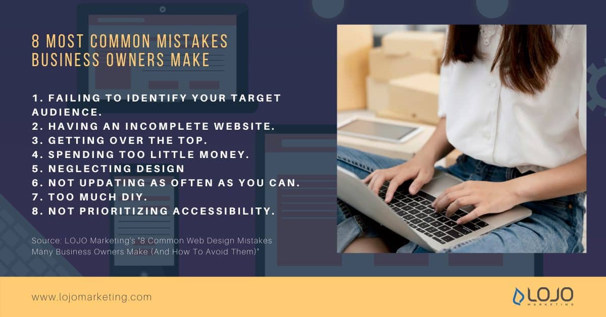
1. Failing to identify your target audience
Although you may want to cater to as many people as possible, targeting everyone is not an option.
Forgetting to point out your target audience to save time can lead to a website that is not very successful.
Attempting to target everyone or forgetting to point out a specific target market can cost you thousands of dollars. Focus on what you think your target market will like and what will give them the best possible experience.
Knowing what your customers is all about is covered by your own notes on buyer personas. Read more about it here, in one of our previous articles, “Buyer Personas: Why They are Important and Why You Should Have Them.”
“A successful website does three things: It attracts the right kinds of visitors. (It) guides them to the main services or products you offer. (It) collects contact details for future ongoing relations.”
–Mohamed Saad
2. Having an incomplete website
The next thing you should do is make sure your website is complete. This is one of the most common web design mistakes. You could be losing traffic due to missing elements in your website. People are quick to leave a site when they don’t immediately find what they are looking for. This could be as simple as missing contact information. What you should know is that there are crucial components that your website should have.
The following are the things your website must always have:
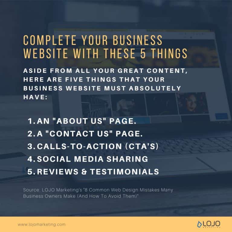
An ‘About Us’ Page
Yes, people still do indeed read those pages on websites, and for a good reason too; an ‘About Us’ page gives visitors and potential customers a way to get to know more about your business, and it’s history, thus giving them all the more opportunity to have a way of connecting to your brand.
This page is also an avenue for you to present your business in a way that your products and services can only implicitly do so.
Contact Info
We want to reiterate how important it is to have your company’s correct contact information easily accessible on your website’s homepage.
We recommend having a page devoted specifically to more detailed contact information. But since your homepage is the first thing people will usually encounter on your website, having that contact information clearly visible on it is vital for maintaining steady traffic flow.
We had a previous article not too long ago, “Is There Ever a Time to Not Have a Contact Page on a Site?“ and the quick answer is: if you want to keep bringing in business, you gotta have one on your website.
Calls-to-Action (CTA’s)
In addition to providing the greatest potential for leads, Calls-to-Action are key when it comes to generating traffic for your website.
The Call-to-Action of a site or page is where you have the opportunity to collect contact information from the visitor in exchange for some type of offer, say a free eBook download or other valuable offers, thus allowing you to connect with them in the future.
Calls-to-Action are both, directly and indirectly, related to traffic (or the lack of it), and missing even one chance at a CTA is a big missed opportunity.
Social Media Components
Social media is one of the most powerful marketing tools your business can utilize. If you aren’t engaging in some form of social media, then not only is your website losing traffic, but your business is losing customers as well. And social media is all about quality, not quantity.
Don’t make the mistake of assuming you need to be engaged on every single platform. Rather, it’s a smart idea to have ways for visitors to access one or more of the social media outlets your business uses, be it Facebook, Twitter, or Instagram, on your website.
If you are not currently on any of these platforms, now is the time to do so! You’ll be surprised by how much traffic a website can generate after strategically engaging in their social media accounts.
Reviews and testimonials
A review page now has undeniable value for businesses. Research shows that 87% of people read online reviews for local businesses, and about 80% trust online reviews as much as personal recommendations.
Believe it or not, you really could be losing traffic due to something as minor as not having enough testimonials from previous clients indicating how satisfied they were with you and your company.

3. Getting over the top
Sometimes, simpler designs are the most effective for marketing strategies. Over-designing your website will ensure your potential customers spend very little time on it. Avoid this web design mistake by making your site attractive, easy to navigate, and don’t overwhelm them with too many functionalities.
4. Spending too little money
Paying for a cheap design will get you a cheap-looking site. But you also don’t want to break the bank and hire a web design company that only works with big businesses and have an inadequate site for your small business.
When thinking about hiring a web design company, do your research, hire a company that works with your business type.
The team at LOJO has years of experience working with small and medium-sized businesses; we know what it takes to design a website for a business that is only starting out. We can help you build your audience with a responsible and market targeting design.
Remember: marketing helps fuel a company’s growth. It goes hand-in-hand with sales and business development, and with a well-implemented plan in place, you can expect your marketing efforts to bring in a steady stream of leads to nurture into (much-needed) new business. Read more about it here in one of our previous articles, “Why Should I Hire a Digital Marketing Agency?”
5. Not Taking Design Seriously
It’s time we give some tips on how you can design your website for higher conversions.
Gone were the days of blinking, rolling texts, colorful backgrounds, and even audio playing in the background. Nowadays, web designers have put away those practices and have leveled up the game with professional website designs.
As a premier web design company, LOJO Sacramento has continuously changed their game plan to meet our clients’ demands. Along the way, we have created some practices that we apply to our projects; and now, let us share with you web design the LOJO way!
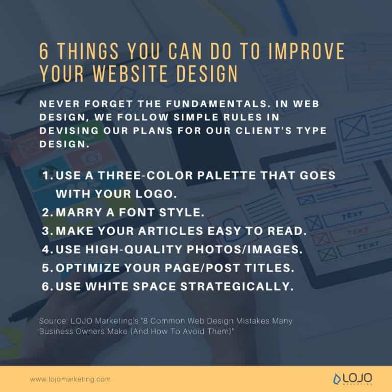
Make your articles easy to read.
In designing an article page, make sure to use a font type such as a serif typeface.
Increase the size of your font so your readers can read them easily. 16px is a good baseline. Lines shouldn’t be too long; the article shouldn’t sweep across the monitor.
Ease the article into a format that will make it easier for the reader to read downwards. As much as possible, don’t design a page that will make your eyes sweep from side to side as it may tire your eyes, hence reducing readability on your audience’s part.
Use high-quality photos/images.
Let them see the clear picture. Literally. Low-quality pictures are so 2000s. Upload the right size of the image, or better yet, provide a high-resolution photo of the product to improve sales conversion.
In eCommerce web designing, images say it all. It passes the final judgment in making potential customers click that buy button. Your clients should exactly know what they should expect to get from their purchase online. A clear, non-pixelated photo can definitely boost conversion rates.
Optimize your page/post titles.
Titles, whether of articles or pages, should be: bold, concise but catchy, and easy to the eyes to deliver the information readily. This entices the readers to read the article as their brains have processed the titles with ease.
Use white space strategically.
We all need space. If there’s time for work, then there’s time for rest. Let your audience breathe while browsing your site. A crowded page that’s chock full of text and images will pull your conversion rates down. Keep it clean and light on the eyes.
Most minimalist web designs done by LOJO Marketing reaped benefits with minding their own personal space. People don’t want to be overwhelmed with text and photos, so learn how to use space to your advantage.
Use a three-color palette that goes with your logo.
Three’s a great crowd. Remember the number three. Use a three-color palette that goes well with your logo. Pick up from there, and stick with those three colors. You can interchange those colors at any given time.
Again, we’re talking about consistency. It plays a great part in pursuing high conversion rates, so be observant of the most appropriate mix of colors that will go well on the site.
Marry a font style.
Choose a font style that speaks for you and your company and stick with it. You will not want to use boring, serious fonts if you’re selling children’s toys. As Helvetica made it into the limelight, there are other font styles such as Merriweather Sans and Proxima Nova you can consider. A consistent font style increases readability and familiarity with your audience.
6. Not updating as often as you can
You have to ensure that your website provides the correct and latest information to everyone who sees it.
Appealing and updated content is important as your customers may assume you’re no longer in business, or worse, you’re not innovative enough to get ahead of the competition. Periodically updating your content is important.

7. Too much DIY
People are finding new ways to make their own shampoo and sew their own clothes, but making your own website should be left to the professionals. Though it can save you a lot of money, a DIY site can drive customers away.
8. Not prioritizing accessibility
People are always on their phones nowadays. Having a mobile-friendly website is important to your business. You also want your business to become accessible to as many people as possible. Meaning, you should address accessibility issues seriously.
Why Is It Important To Have Professional Website Design?
In order to avoid making common web design mistakes, it is good to have it professionally designed. There are numerous ways a professional website benefits your business, and they extend beyond simply having an online presence and closing leads.
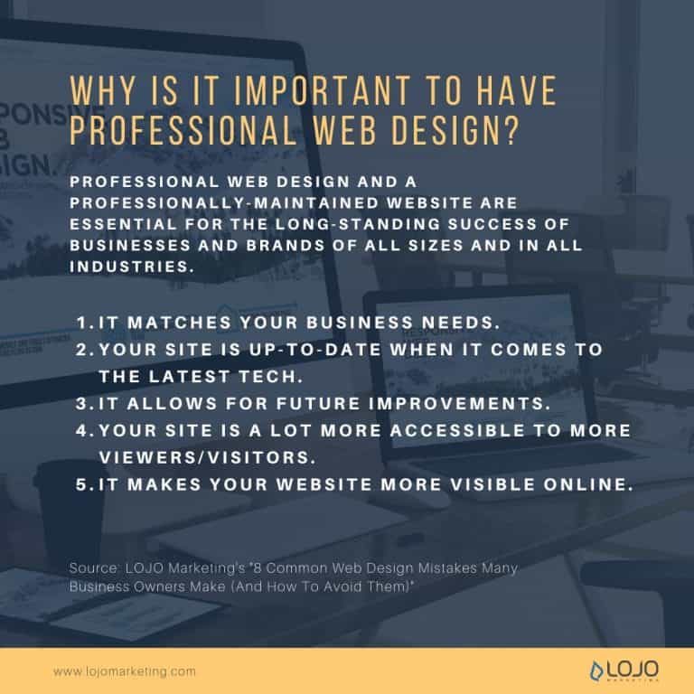
Here are the top reasons why you should get a professionally designed website:
It matches your business needs.
A professional website designer can make a site fit exactly how you need it to be: No matter what industry your business operates in, who your target audience is, how present your business is on social media, or even how proficient you are with technology yourself, a professional website design team can work with you to create a unique site that speaks to your needs.
Are you looking to increase online sales? Do you want to establish a better online presence? Do you want to communicate better with your audience? No matter what your business’s needs and goals are, a web design company can use that information to build the ideal website for what you’re trying to accomplish.
Your site is up-to-date when it comes to the latest tech.
There’s a lot to keep up with nowadays: the number and scope of online technologies that influence content marketing are improving and expanding all the time. It will be hard for you to manage all your business’s day-to-day activities and stay on top of this new technology. That’s why professional website design companies like us are here ー to keep up with all this, so you don’t have to!
Your site is a lot more accessible to more viewers/visitors.
It’s all about the presentation and accessibility: Have you ever looked up a company or a product on your phone to get some quick information, only to click on the link to the site and get taken to a non-mobile-friendly site? When this happens, chances are people lose interest.
However, when you have a professional website designer in charge of things like mobile-friendly site presentation, your visitors can seamlessly interact with your brand on all platforms and from all devices. There are also certain laws regarding accessibility that you have to consider. A professional web designer can make sure your website adheres to the law.
It makes your website more visible online.
Get noticed by potential leads online: There’s much more to having a successful website than search engine optimization. One of the benefits of using a website design team is that the analysis provided by the marketing and sales teams can help better inform you of what your visitors and leads are looking for. It means that you can provide the right content to help attract people to your site and your business.
A professional website will get your business noticed in ways that online website-building services typically don’t because of the comprehensive approach we take to create and distribute content to your audience.
It allows for future improvements.
A website is always evolving and improving: By using analytics and trends to inform changes and improvements, a professional website is always evolving and always maintaining a fresh relationship with the visitors. This is accomplished by a website design team who are constantly working to create new and meaningful content that produces leads, and ultimately brand awareness.
A Final Word About Common Business Web Design Mistakes
Professional web design and a professionally-maintained website are essential for the long-standing success of businesses and brands of all sizes and in all industries.
Now that you’re more aware and have a better understanding of the most common web design mistakes business owners make, are you ready to create your own website and address all the things you need to make it a great one?
Well, here at LOJO, we’re all too aware of how daunting that task might be. And that’s why we’re here!
LOJO Marketing is dedicated to bringing out the potential of your business, online or offline. We can make a website that is perfect for your business, so you won’t have to! Don’t miss out on the chance to grow your business. Contact us, and we can start today!
Built for Growth. Backed by 25 Years of Trust.
For over two decades, LOJO has been a trusted partner to hundreds of businesses just like yours. Whether working directly with owners, managers, teams, or boards of directors, our goal remains the same: to be a reliable and results-driven asset to your business.
Over the years, we’ve carefully built a team of experts—each selected for their unique skills, strengths, and personalities. Our clients choose LOJO because they know we genuinely care about their success.
And after 25 years of helping businesses grow, we’re more committed than ever.


Matthew Rogers, President
iProspect Check
After spending several months reviewing multiple proposals from several different companies we engaged LOJO to develop a new website that represents our company effectively. We worked initially with Stephen Platte who helped create the scope of the project. Stephen was knowledgeable and always followed up with me on time and as promised.
He "closed the deal" for LOJO with his professionalism, service orientation and easy going approach. Once we signed the contract we were introduced to Jay Kelly who would be the creative lead for LOJO. This was the most challenging part of the project for my company, as there was no shortage of ideas from our side. Jay managed the project flawlessly, and once we had all agreed to the design, Jay introduced us to Eric.
Eric Lay is one of the founders of LOJO. Eric took the design we had developed and brought it to life. We delivered content as quickly as he requested it. Eric kept the project on task and we responded by exceeding every deadline for content. In turn, once provided, literally not a day went by that Eric didn't add the content and take the next step. In just a few weeks we launched our new website. Eric is a pleasure to work with.
His positive attitude and consultative approach really enhanced the experience and made a big difference for us in the outcome of our project. We would welcome you to visit our website to take a look at the quality work of LOJO. We are very pleased with LOJO and look forward to working with them in the future as we pursue an aggressive SEO strategy."

Matthew Rogers, President
iProspect Check
The team at LOJO were wonderful to work with. They are well organized and very patient as we worked through our marketing strategy and developed a well thought out and clear action plan at a reasonable price. We will definitely be back for our future campaign needs."

Jon Crosby, Founder
Dazil

